The Work
The System, Applied
Interior design · A complete brand system + Instagram page management · A three-month project
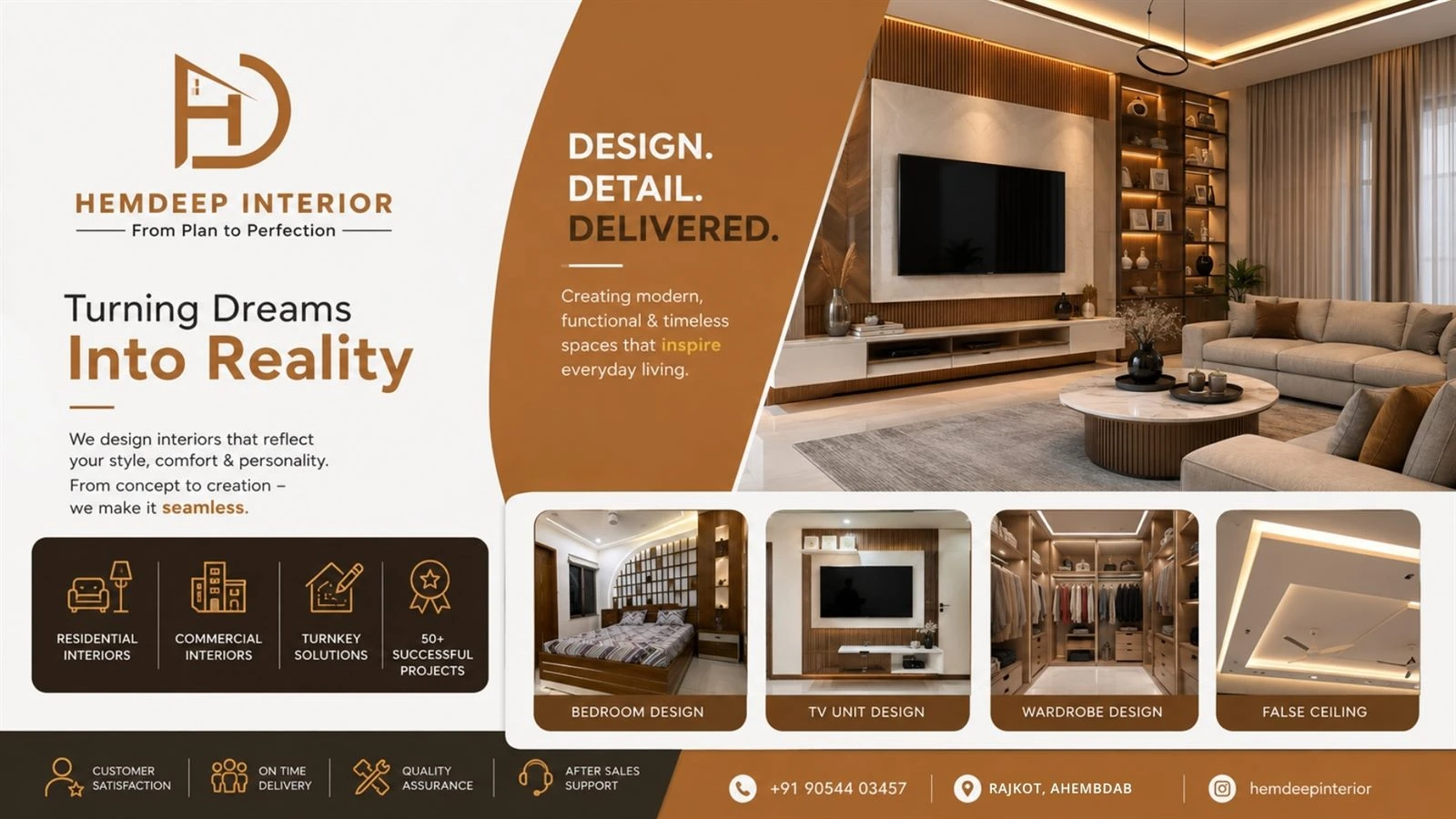
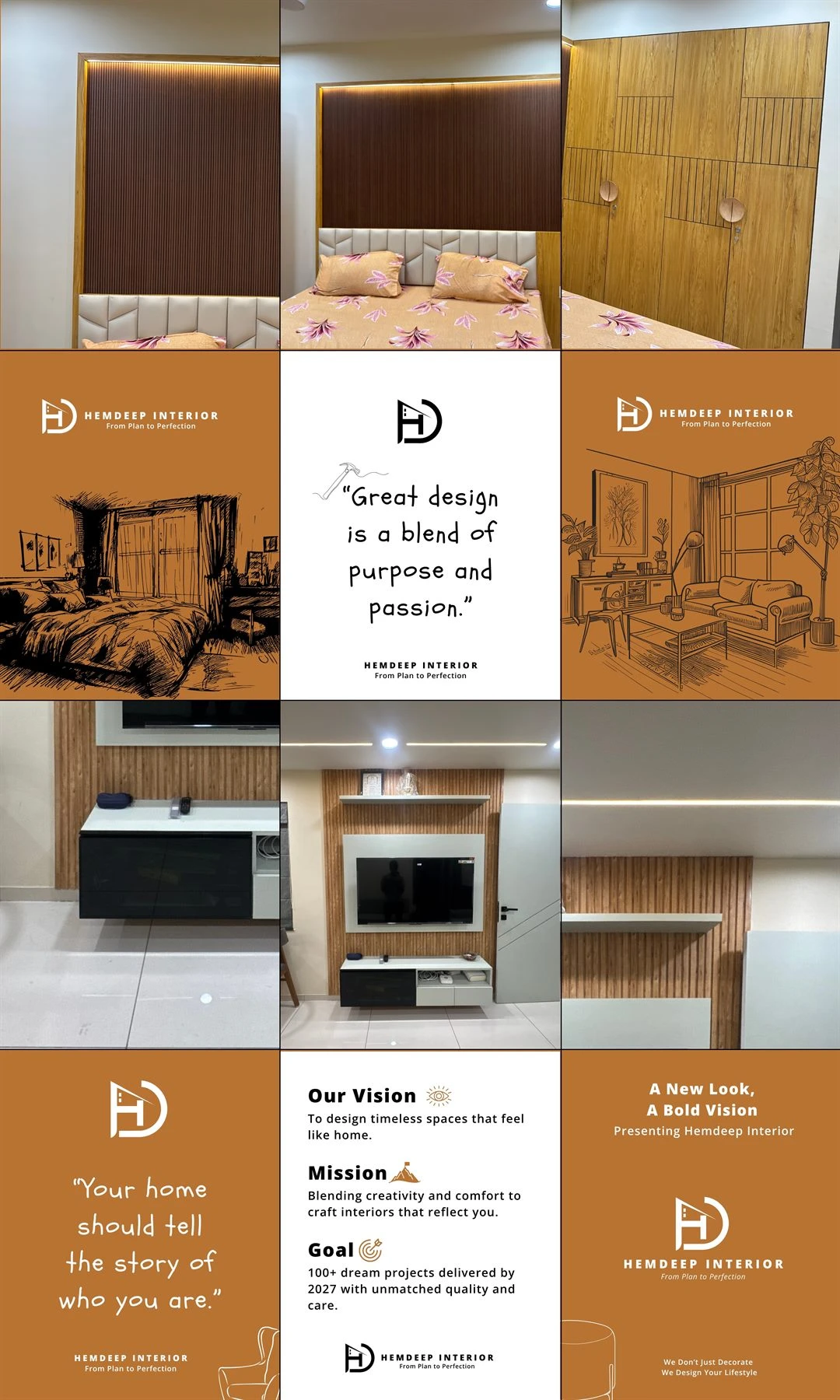
Hemdeep Interior is an interior design business that needed a real brand identity, not a placeholder logo, plus consistent social media handling. Over a three-month project, Safar Spectrum Media built a technically rigorous brand system: an HD rooftop lettermark, a defined clear-space rule, a full logo variation set, print and signboard standards, and ongoing Instagram page management.
No lead count or growth percentage appears on this page. This was a brand and social engagement, and the record confirms the completeness of the system delivered and that it went into real use, not a specific number.
Hemdeep Interior came to Safar Spectrum Media needing a brand, not a logo file. An interior design business is judged on how finished everything around it looks, from the Instagram grid to the invoice to the board above the office. If those pieces don't match, the work behind them reads as less considered than it is.
The specific ask was foundational: a real identity that could be used correctly by other people later, and consistent social handling on top of it. It also had to survive being printed. A brand that only holds together at Instagram size is no use to a business whose name goes on a signboard.
So this was a build-the-rules engagement. Not just draw a mark, but define how it's spaced, which version goes where, and what it looks like on paper and on a wall, then run the social account to that same standard.
The engagement was a three-month project covering the brand identity and ongoing Instagram page management together. It is the same brand and social work SSM runs for a business that needs its identity built properly and then kept consistent.
The core mark combines an "H" and a "D" into a rooftop-shaped icon, a small nod to what the business does. Around it, SSM built a full variation set: the full logo, the symbol on its own, a horizontal lockup and a monochrome version, so there's a correct logo for every place it needs to sit rather than one file stretched to fit.
The clear-space rule uses the height of a key letter as the spacing unit, so anyone placing the logo keeps the same breathing room without guessing. The colour direction pairs a Charcoal primary with a Deep Teal or Warm Gold accent, defined so the brand looks deliberate whether it's on a dark background or a printed card. These are the rules that stop a brand drifting out of shape once the agency hands it over.
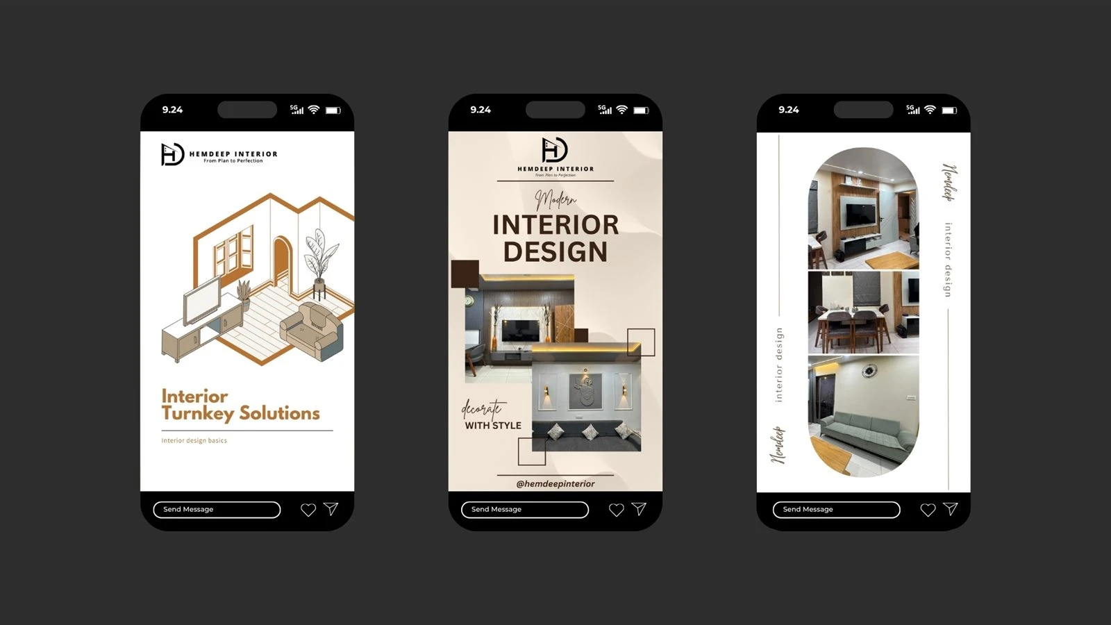
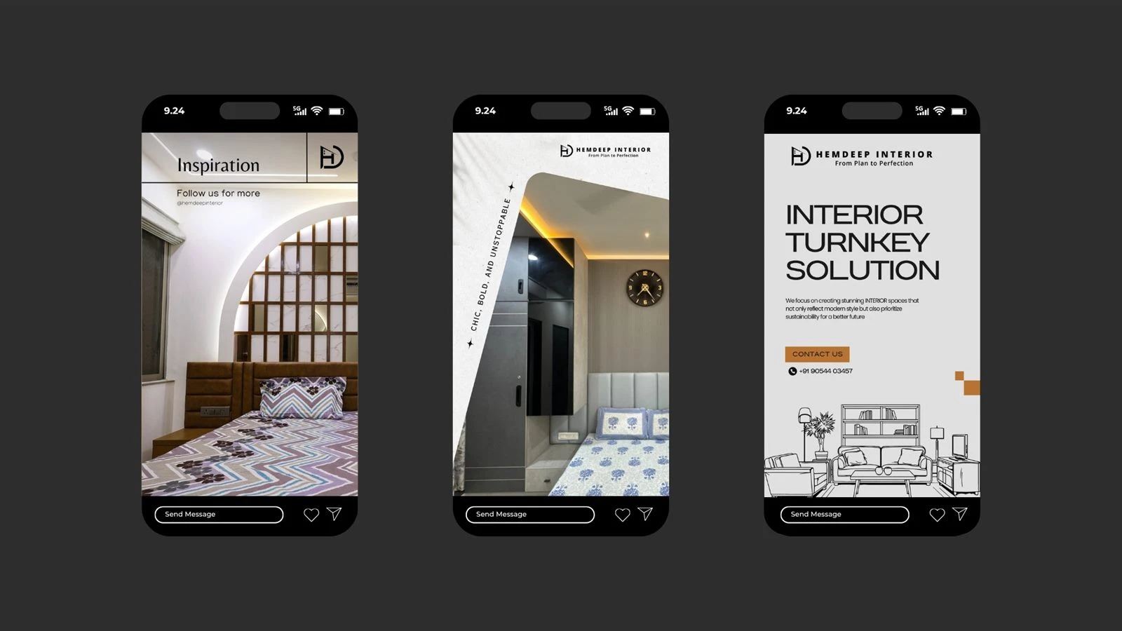
The system was built to work across business cards, letterhead and invoices, social bios, website headers and print signage, and signboard design files were delivered as part of the work. For an interior business, the shopfront and the stationery carry as much weight as the feed, and the brand had to hold up on all of it.
Alongside the identity, SSM ran the Instagram page as a monthly service for the length of the project, so the account was posted and managed to the same standard the brand was built to. A rigorous brand and a neglected feed cancel each other out.
There's no lead number or growth figure on this page, and that's deliberate. This was a brand-and-social engagement, and the record doesn't carry a metric to show without inventing one.
What it did deliver is a complete, technically rigorous brand system: clear-space rules, a full logo variation set, and guidance for physical and digital formats, all put into real use across signage and social media for the full engagement. That is the point of a system like this. Not the launch day, but the year after, when the brand still looks like itself because the rules were there to follow.
For a three-month package, a brand a business can actually run without breaking it is the result worth reporting, and this one still stands as an example of what a proper identity build looks like.
More than a logo. For Hemdeep Interior, Safar Spectrum Media built an HD rooftop-shaped lettermark, a defined clear-space rule, a full set of logo variations for full, symbol-only, horizontal and monochrome use, and a Charcoal primary colour with a Deep Teal or Warm Gold accent, so the brand stays consistent everywhere.
So the logo survives being used by other people. Hemdeep Interior's clear-space rule uses the height of a key letter as the spacing unit, and the variation set gives the right logo for a business card, a website header or a signboard. Without those rules, a mark drifts out of shape within months.
For an interior design business, yes. Hemdeep Interior's brand was built to hold up on business cards, letterhead and invoices, social bios, website headers and print signage, with signboard design files delivered as part of the work. A brand that only works on a phone falls apart at the shopfront.
Our guide to why a brand looks cheap covers the exact gaps a system like this closes, and marketing an interior design business on Instagram covers the content layer on top. See more interior work in the portfolio, or read the rest of our case studies.
We use cookies to understand how the site is used and to improve it. You can accept or decline analytics & ads cookies. Privacy Policy.